Change the world,
one word at a time.
Branding, digital, advertising.
Challenge:
Duolingo is the world’s favorite language learning app, downloaded by 300 million people. Its mission is to make education free, fun and accessible to everyone through a ‘gamified’ approach to education. Our brief was to codify and extend the experience of the product into a full brand identity system, through logo, type, color, photography and tone of voice.
Solution:
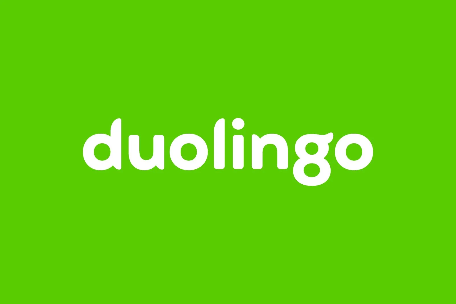
The rebrand includes a playful logotype and bespoke typeface inspired by their mascot, Duo the the owl. Uncompromisingly quirky and approachable, the new identity differentiates the Pittsburgh based tech success from the minimalistic design of Silicon Valley.
Working closely with Phil Garnham at Fontsmith (now Monotype) we evolved our sketches into the full alphabet of Feather Bold.
We commissioned photographer Niall McDiarmid to create a suite of portraits of real Duoloingo users.
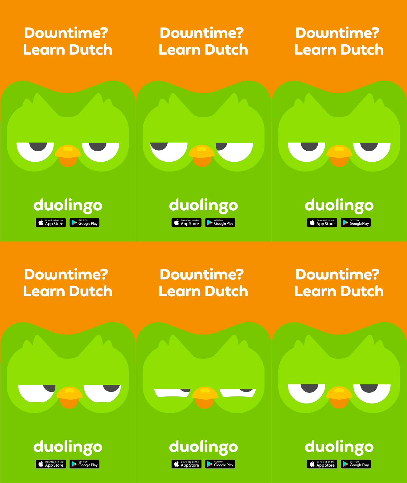
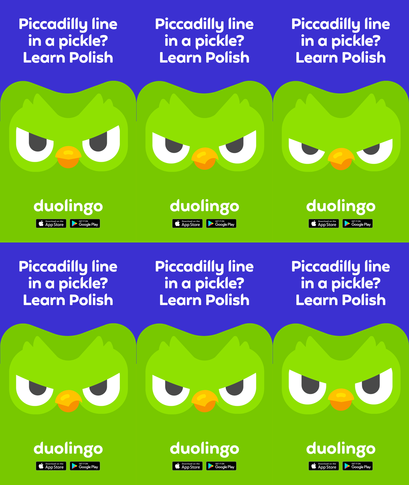
Brand launch campaign
Studio: Johnson Banks
Client: Duolingo
Creative Director: Michael Johnson
Design Director: Lara Juriansz
Lead Designer: Beth Johnson
Account Director: Katherine Heaton
Font design: Fontsmith
Brand photography: Niall McDiarmid
Illustration: Duolingo design team
Messaging: Nick Asbury
Brand launch campaign:  And Rising


